Project Overview
This project was created over a 10 week period in response to an issue facing the healthcare system. During this time I investigated the problem space, conducted market research & interviews, and used my findings to formulate a potential solution. Once my initial iteration was completed I conducted 2 rounds of user testing and gathered feedback to arrive at the current solution. Included in this project are UX design artifacts, UI responses & library, and a responsive marketing site.
Discovery
Problem Space
Current State
Visiting an Emergency Room or Walk-in Clinic is a frustrating/time consuming process. Patient’s will often not seek care when needed because the process is too long, waiting rooms are overcrowded and facility staff are often overwhelmed.
Design Question
How might we enhance the experience of visiting a Walk-in Clinic and/or Hospital Emergency Room to create a more positive experience for patients?
Project Vision
Our mobile application leverages the use of technology and automation to help patients who want timely access to medical care by reducing wait-room times, improving communication, and fostering patient-care facility relationships. We provide convenient mobile access to medical care that is engaging and interactive, unlike other alternative web based applications.
Assumptions
The main assumptions I am operating under for creating a solution are 1) The medical industry will buy into this solution and will be willing to work with us to make this a success. 2) We will be able to integrate our system with medical facility management software.
Approach
Research
Hypothesis
I believe automation of check-in process will decrease the amount of time a patient spends in a wait room; thereby improving the patient experience. I will know this is true when a major theme in my research findings is time-management.
Findings
I used a mixture of surveys and interviews to gather data. I interviewed 6 people and had 28 survey respondents.
Quantitative Results:
-62% of respondents have visited a Walk-in Clinic or Hospital Emergency room in the last 12 months
-52% of respondents take public transportation
-58% of respondents use Walk-in Clinics as their primary source for receiving care
-73% of respondents identified wait times as a major pain-point
-43% identified staff interaction as a major paint-point
-87% choose a facility based on location
-73% choose a facility based on wait-times
-63% identified that they have had a medical issue that should of needed attention but did not go in the past. Major reasons for this included not believing/knowing if the issue was serious enough (88%) and not enough time (53%)
Major Pain-points Identified:
-Privacy
-Wait Times
-Location
-Interaction with Staff
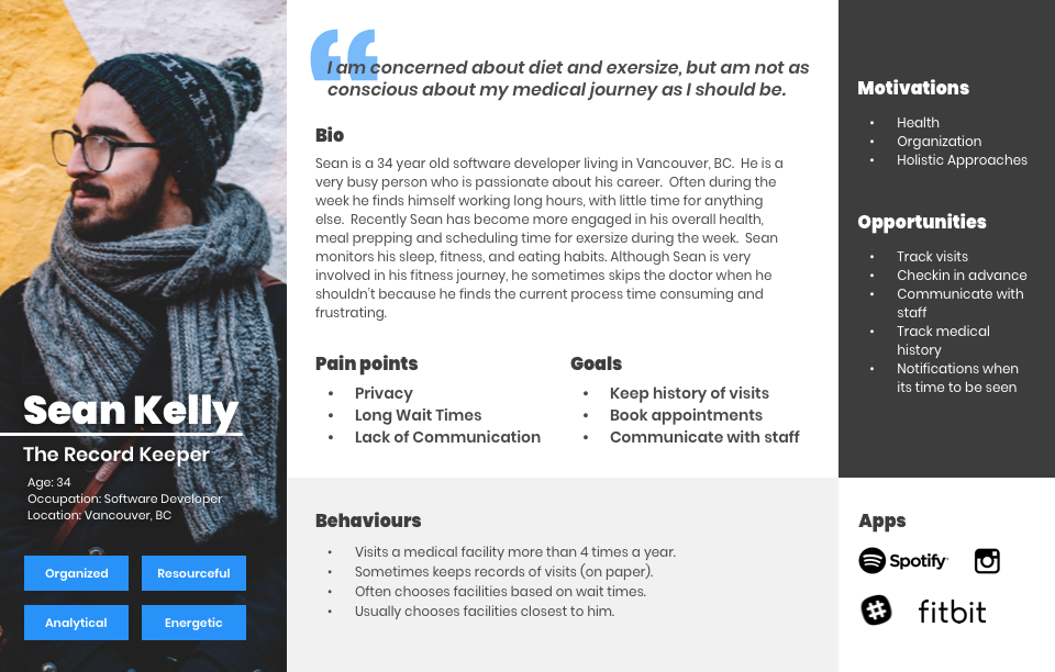
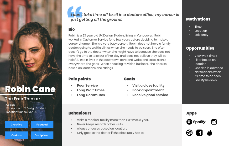
Target
I used the data gathered in my findings to determine my primary and secondary target audience as well as some of their pain-points, goals, and motivations.
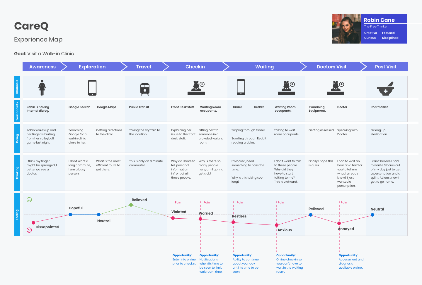
Mapping the Journey
Determining a Touchpoint
In order to determine a touchpoint I mapped how one of the personas identified currently navigates through the problem space. As you can see the major pain-points present themselves in the wait room period. I therefore chose to offer a solution in hopes of greatly reducing the amount of time spent waiting at the facility; thereby eliminating those pain-points.
Exploring a Solution
The MVP
The research and exploration made it clear that the primary epic that would solve for some of the greatest pain-points identified was one which included searching and booking. I therefore chose to tackle that epic first.
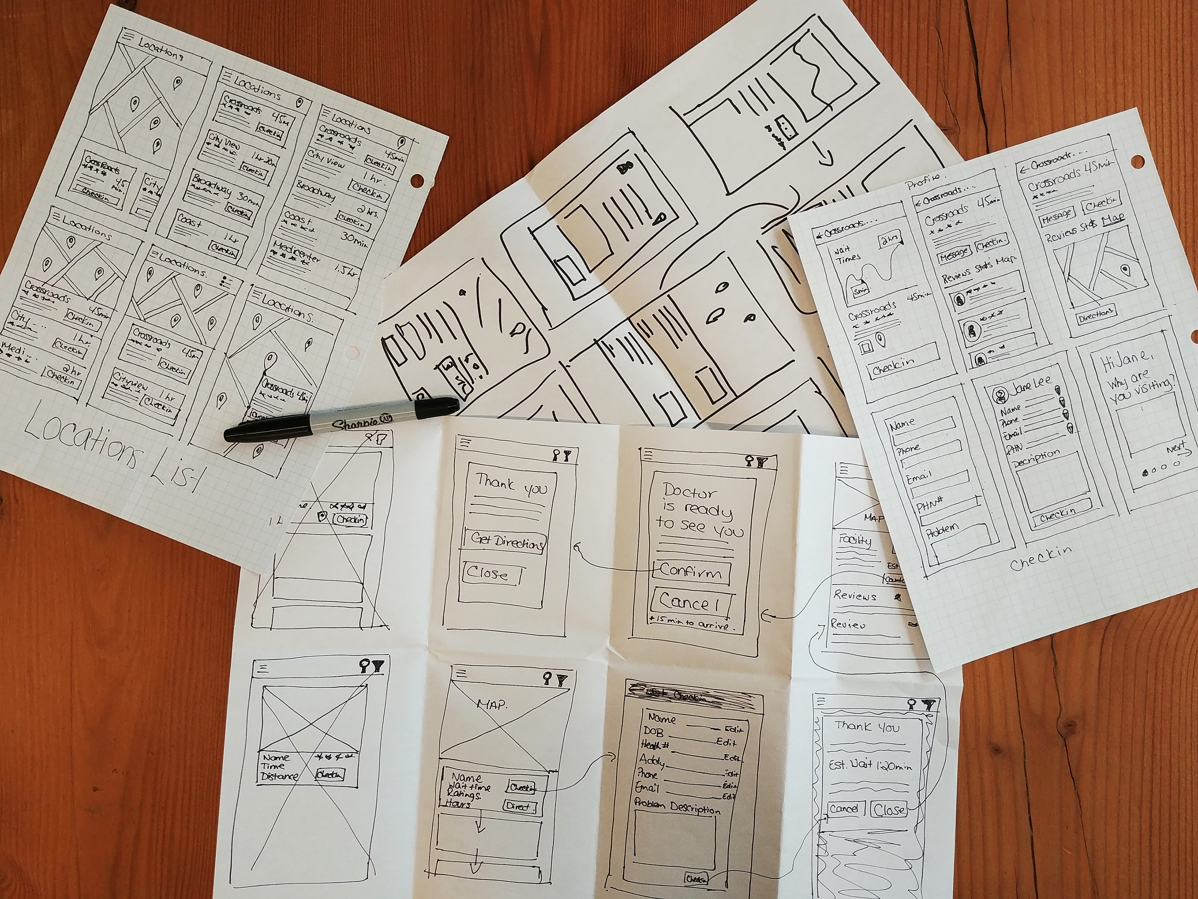
Sketching possible Solutions
Now that a touch-point and MVP was determined, the next steps in the process were sketching some possible layouts and features that would help address the problem. These included searching, filtering, exploring, and booking.
Impact
Solution
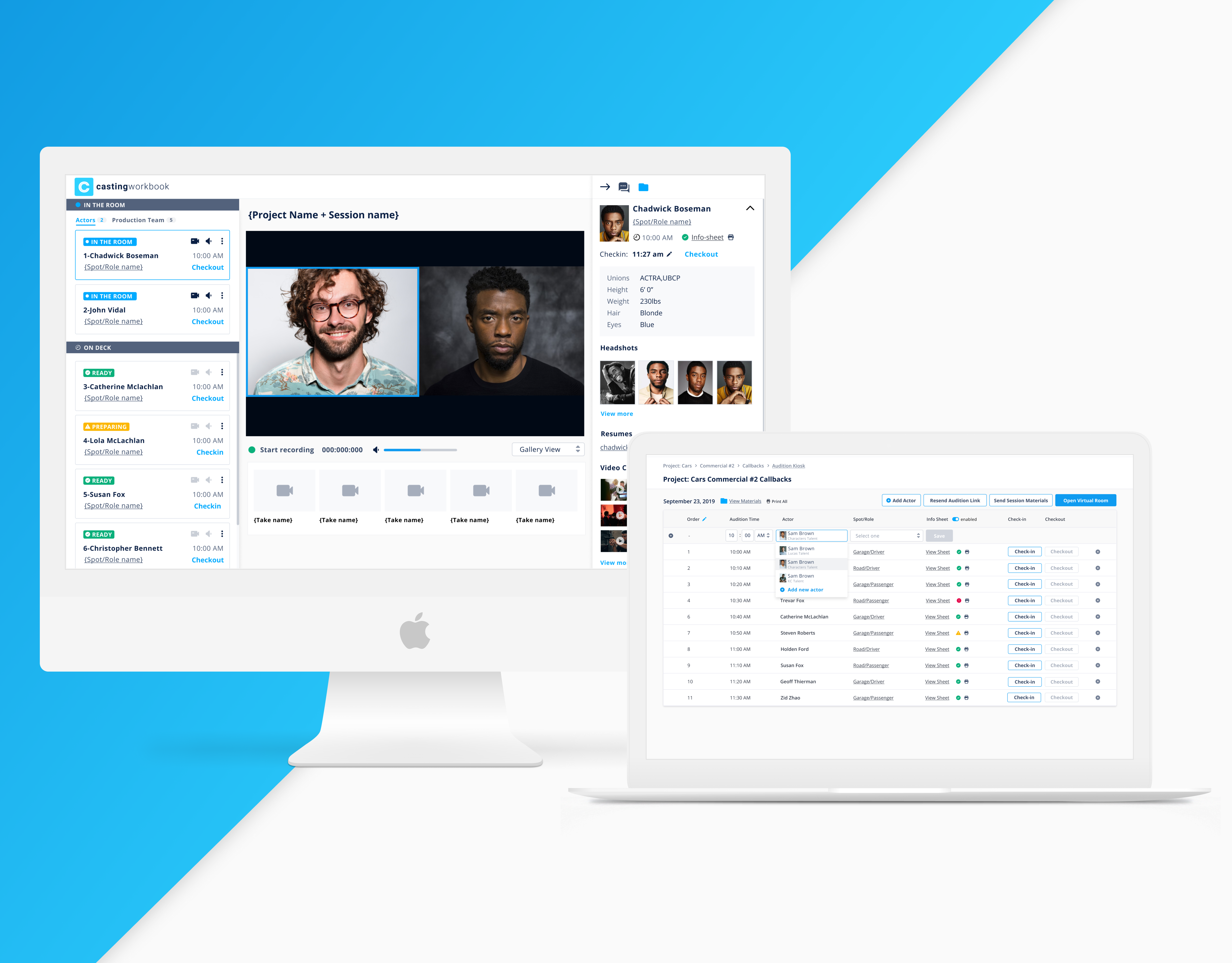
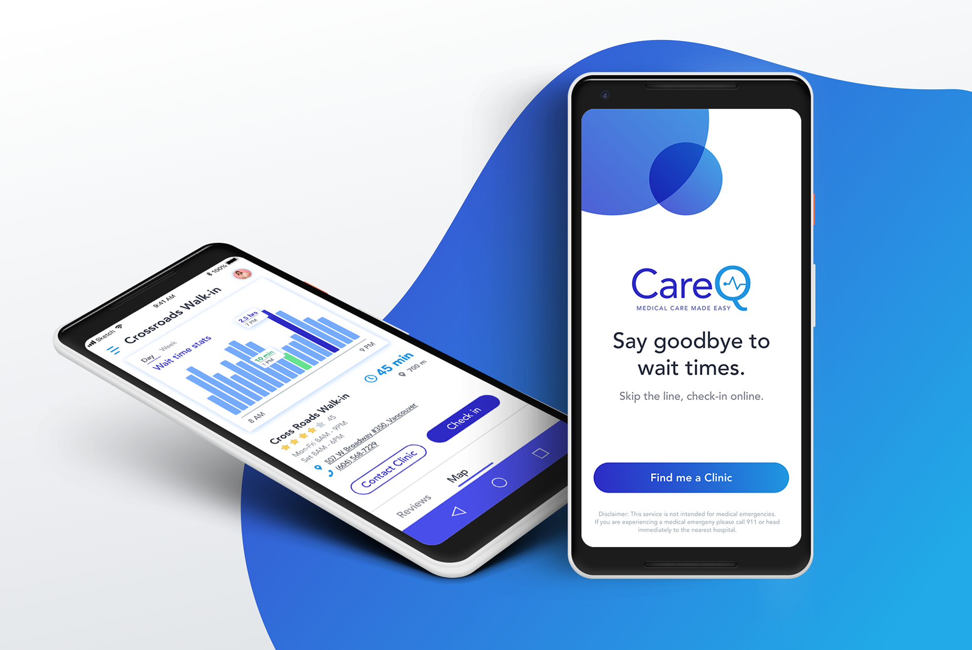
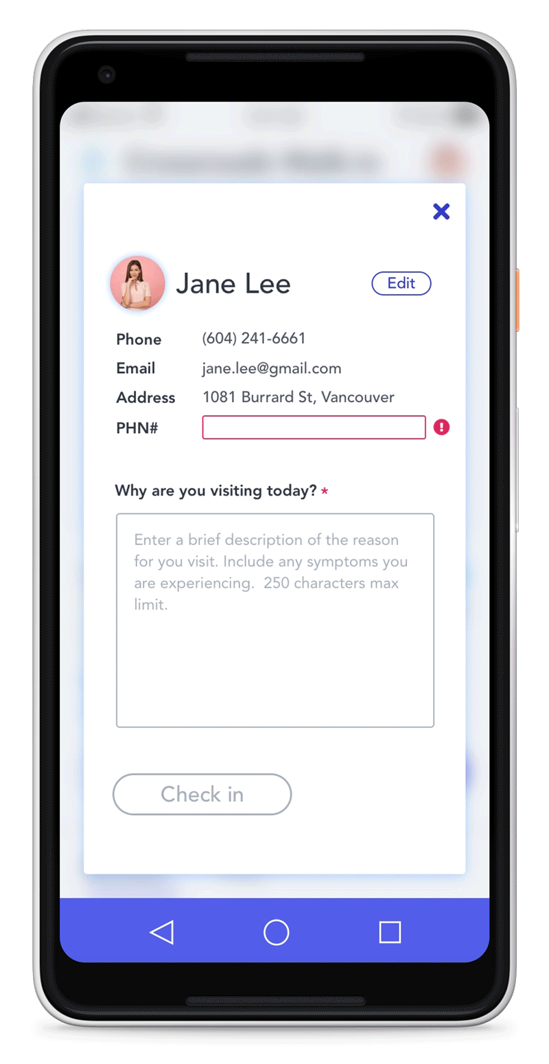
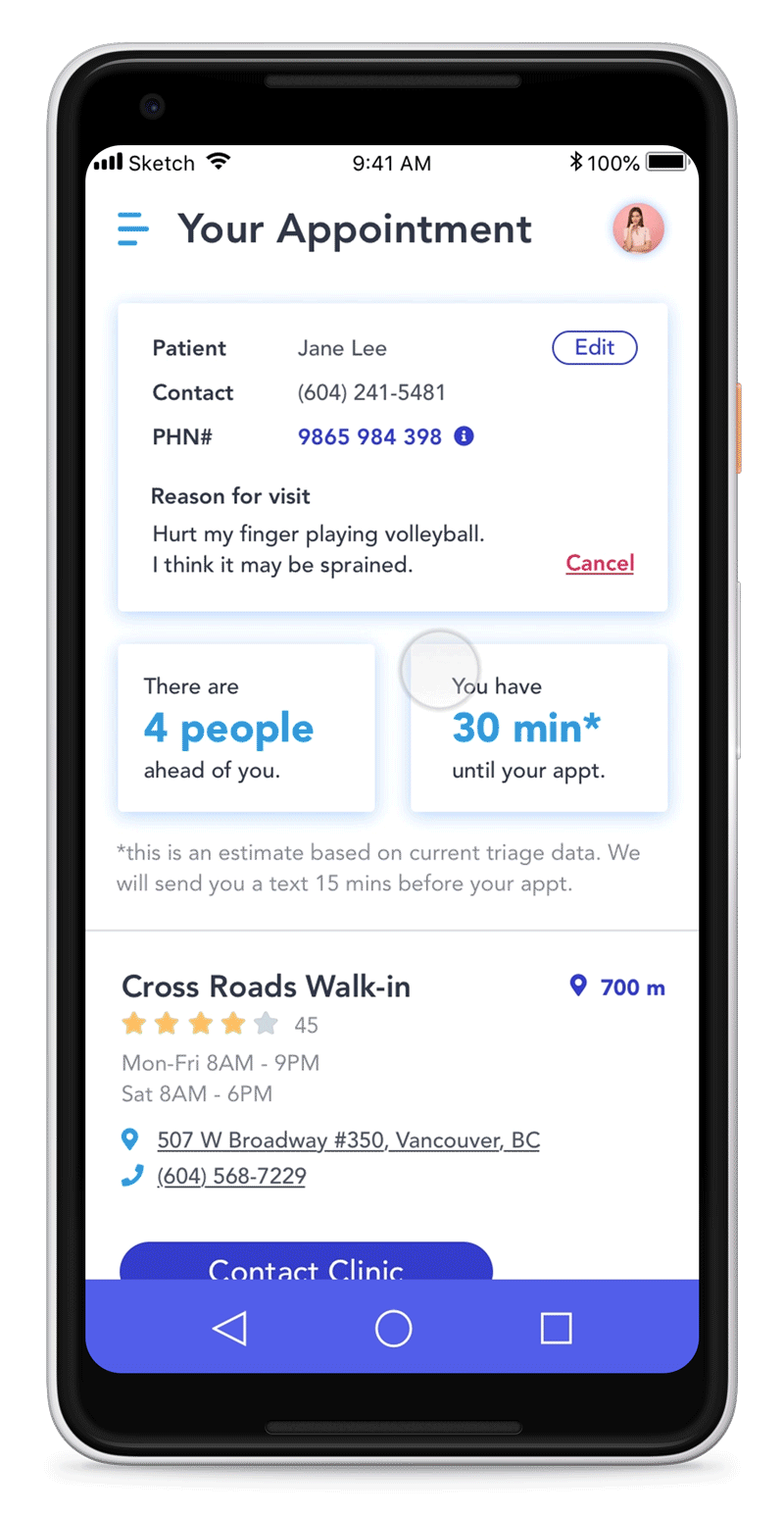
Meet CareQ, an automated online booking system of Walk-in Clinics and Hospital Emergency Rooms. CareQ is an interactive solution which focuses on accessibility standards (AAA), while also being a convenient and reliable option. View the full checkin process below.
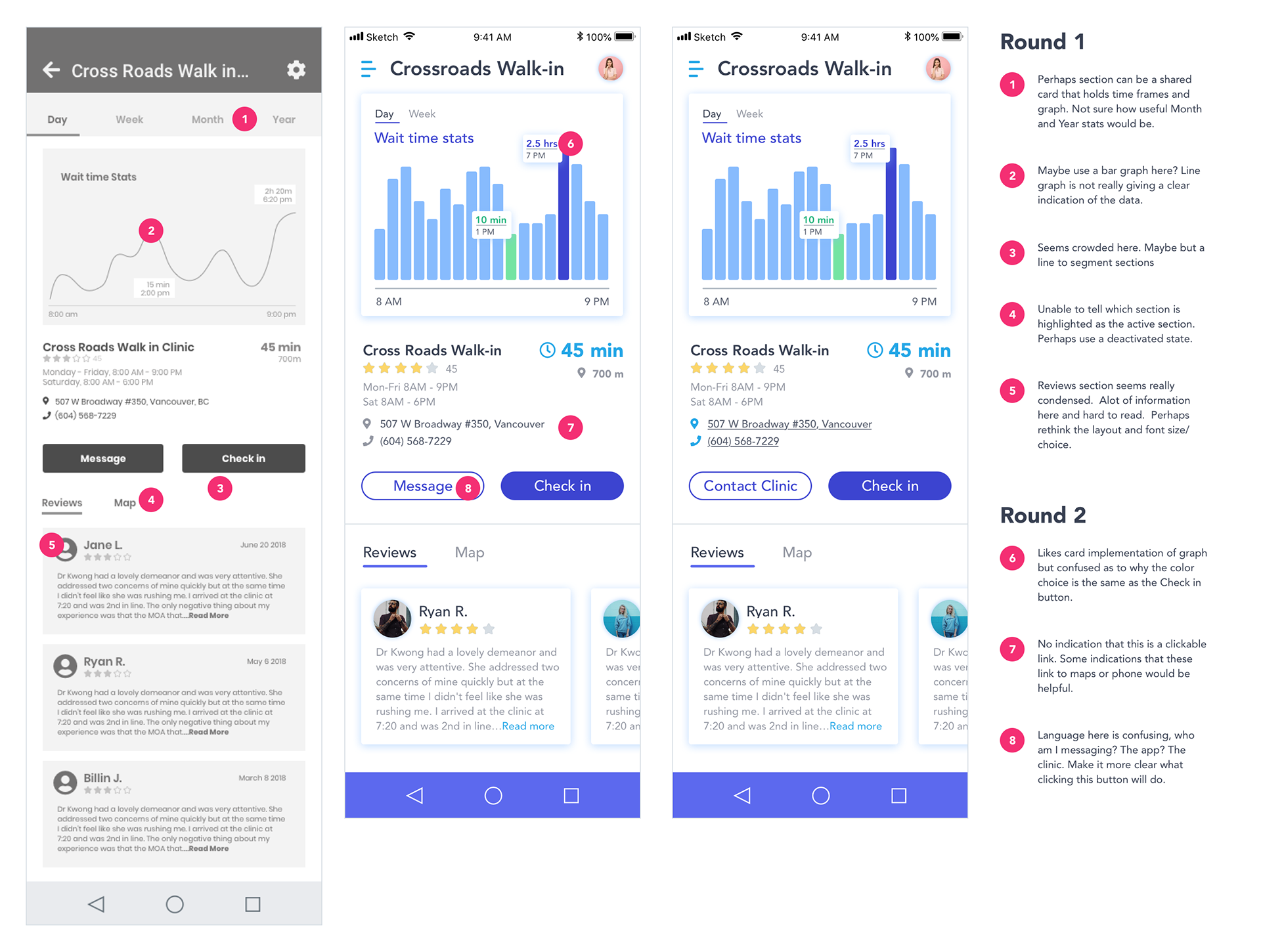
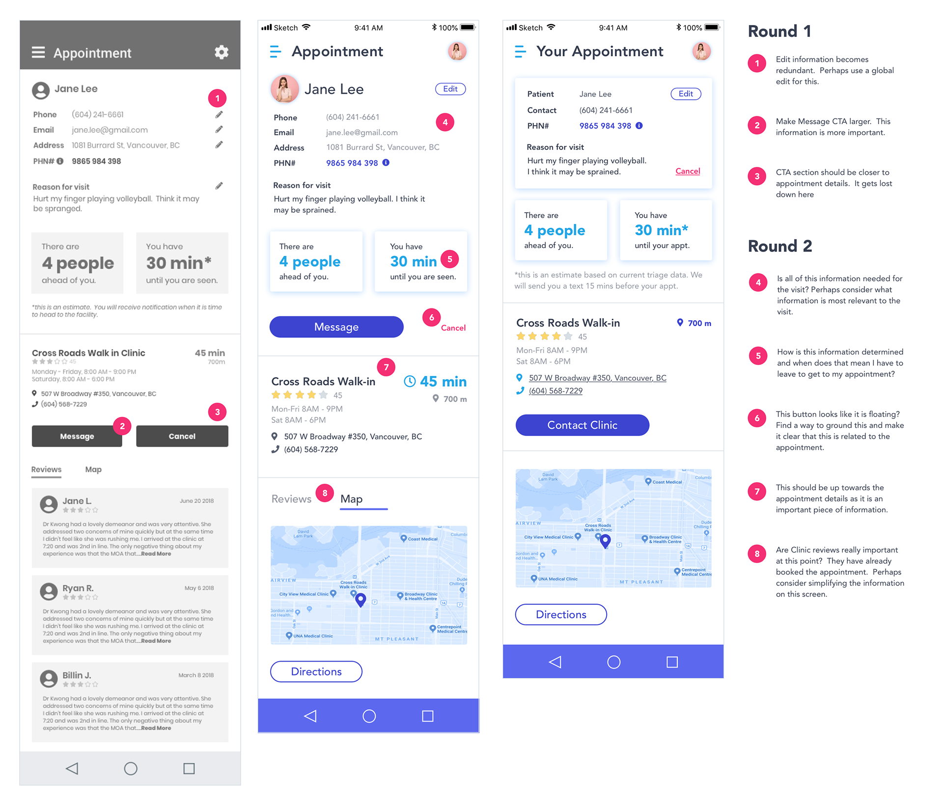
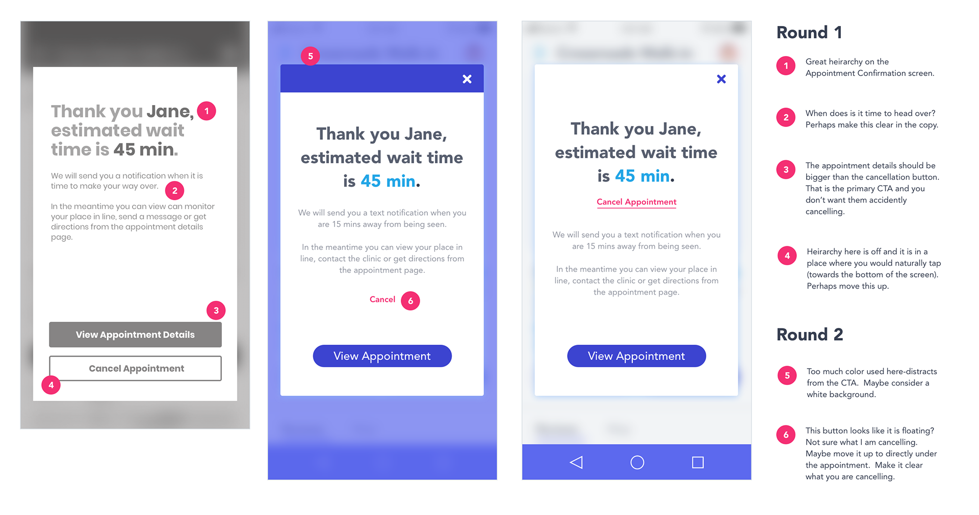
Usability Testing
To arrive at the current iteration I created 2 previous iterations and went through 2 rounds of usability testing. Some of my findings included:
What users liked:
-Graphs were great for a visual representation of best times to visit.
-Layout is clean and easy to read.
-Color choices were trustable and friendly.
-Interactions were clear.
What can be improved:
-Information hierarchy can be cleaned up, especially on the appointment card.
-Language on some of the buttons is a little unclear.
-Too much color used for some of the screens.
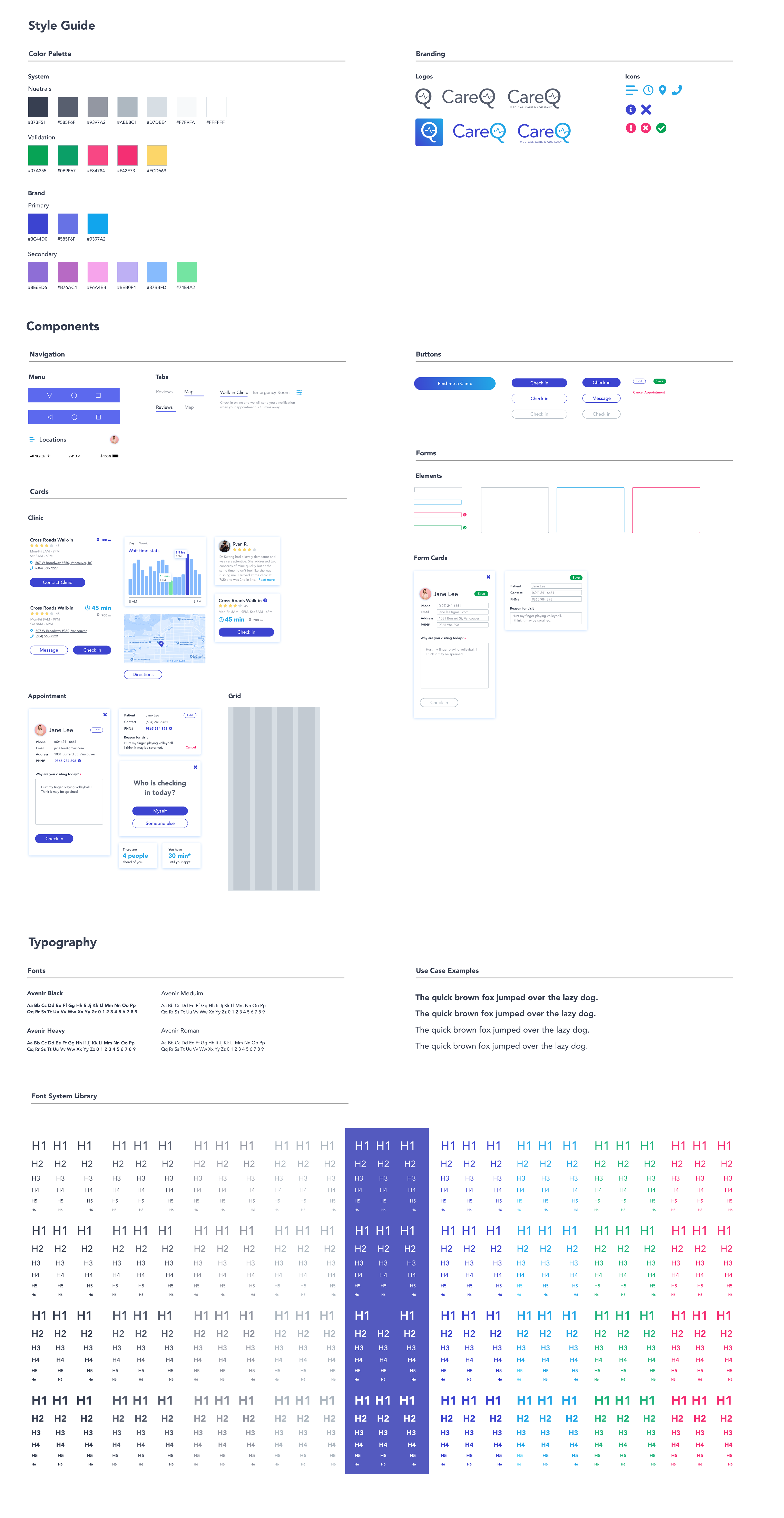
UI Library
I wanted the focus of the color choice and fonts to be based primarily on accessibility given that the edge case users of this product may struggle with accessibility issues such as color blindness or other vision impairments. As part of this process I have also began building out a comprehensive design system including a font library and component library.
Next Steps
Now that 3 rounds of iterations are complete I aim to do one more round of testing on the current task before moving on to designing the other interactions in the app. I eventually see this solution being a full service medical tracking app which not only allows you to book your appointments, but also store medical history and test results within the app. The next task I will focus on is on-boarding.
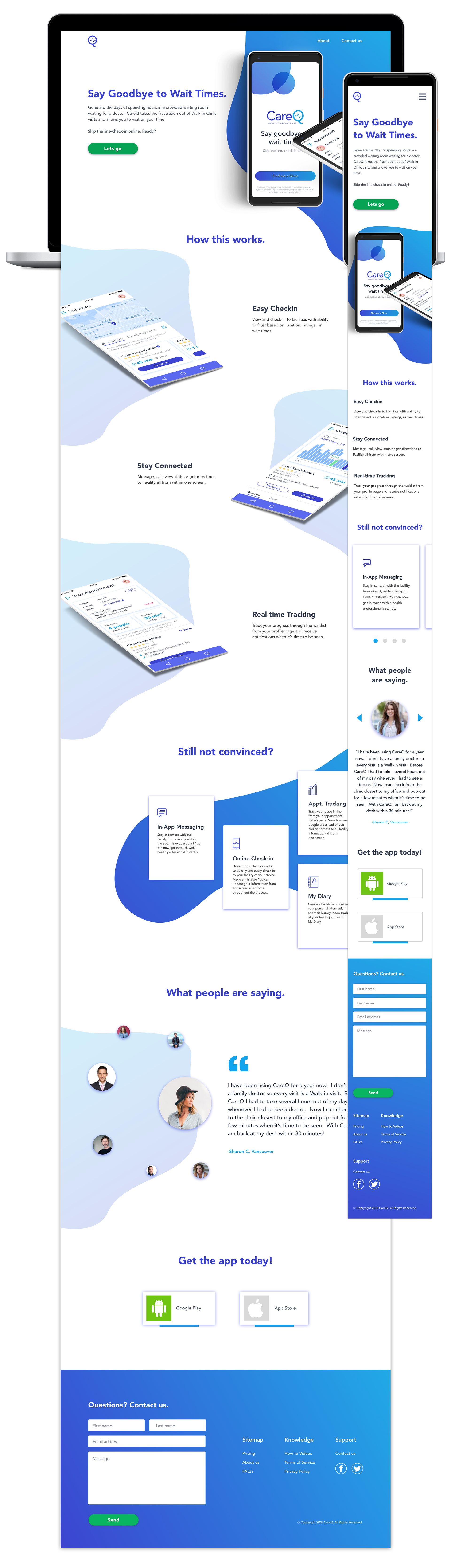
CareQ Marketing
I used the branding and typography created for the application to also create a marketing site. I implemented the same clean style and focus for the marketing site as well as focused on friendly, concise copywriting.