Project Overview
This project was created over a 6 month in period in response to the lack of technological solutions currently in the proptech space. During this time I investigated the problem space, conducted market research & interviews, and used my findings to formulate a a series of feature solutions to help address the needs of landlords and property managers using technology. This project is currently in progress with a beta release of core features going out Aug. 26 2019. I will use the closed beta as an opportunity to test the core features as well as gather additional feedback for future features.
Tools Used
Figma, Sketch, Invision, Lookback.
Approach
Research
Project Vision
Our vision is to improve working relationships between landlord and tenants, ensuring a longer tenancy.
Goal
Double the average length of tenancy terms with good tenants by cultivating trusting and harmonious relationships between landlords and tenants.
Hypotheses
We believe that a cloud based full service property management system would streamline landlords/owners workflow and that they are not currently using an effective property management tool post agreement. We will know this is true when a large portion of respondents are using Craigslist/Kijiji/PadMapper and paper agreements to manage their properties.
We believe that in-app communication will improve the tenant/landlord relationship. We will know this is true when a theme around current communication is identified as a pain-point in our research.
We believe that trust is a major pain-point for users and that implementing trust building tools, such as a verification processes into our platform will help alleviate this pain-point. We will know this is true when a major theme identified in our research is around trust.
Findings
I used a mixture of surveys and interviews to gather data. I interviewed 5 landlords and had 33 survey respondents. If you are interested in seeing the full survey data you can view it here.
Quantitative Results:
-54% of respondents were an owner that manages their properties themselves.
-84% of respondents are managing less than 5 properties
-66% of these properties are apartment/condos
-48% are delivering the lease agreements on paper
-87% are not using a property management tool
-75% of respondents run reference checks
-60% of respondents run a credit check
-83% store their tenant and property related documents on a paper file
-92% communicate with their tenants via email or text as their primary method of communication because they want to keep a record.
-when asked which method they would prefer to access a property management tool, 66% said mobile, 27% said laptop/desktop, and 6% tablet.
Major Pain-points Identified:
-Collecting rent
-Handling service requests
-Tenant verification
-Listing/scheduling showings
Target
I used the data gathered in my findings to determine our primary, secondary, and tertiary target audience as well as some of their pain-points, goals, and motivations.
Exploring a Solution
The MVP
I used the data gathered from my research to formulate 84 landlord user stories organized by epics and then prioritized each user story within these epics to determine which features we will be working on first. For our initial beta release we decided to focus on Maintenance Requests, Properties, Dashboard, and Messaging. Version 2 of the beta will include document storage and lease signing, payments and financial tracking, and vendor relations (a vendor portal).
Some of the major stories that helped to formulate our MVP were:
Maintenance Requests:
1. As a Susan and Rob I want to be able to source vendors so that I can ensure that I can add a trusted cost effective vendor to my list.
2. As a Landlord I want to be able to set the status of a ticket, so that I can keep myself and my tenant informed about where we are in the resolution process.
3. As a Landlord I want to have a record of tickets organized by unit, so that I have proof if disputes arise.
Properties:
1. As a Susan & Rob/Michael I want to see the status of all my properties at a glance so that I know which ones are requiring my attention.
2. As a Landlord I want to view communications related to the property so that I have a historical record.
3. As a Landlord I want to view all information related to a property so I can easily access all items requiring my attention for the unit.
Dashboard:
1. As a Landlord I want to see a task list with items requiring my attention so that I know what needs to be done in the upcoming week.
2. As a Landlord I want see a list of my properties with statuses so that I have an overarching view of what needs my attention.
3. As a Landlord I want to have access to my open service requests so that I can respond in a timely manner.
Messaging:
1. As a Landlord I want quick communication so that it is a more efficient tool to use than my current process.
2. As a Michael I want FB style messaging so that I can use something I am familiar with.
3. As a Landlord I want a record of my communications so that I have proof incase of disputes.
Mapping the Information Architecture.
Before beginning the UX work on the features I first took a look at the Navigational Structure in order to determine how our application was going to function and where each of our MVP features would be accessed within the app. I chose a typical hierarchical structure with some linear flows (in the case of adding a property).
Impact
Solution
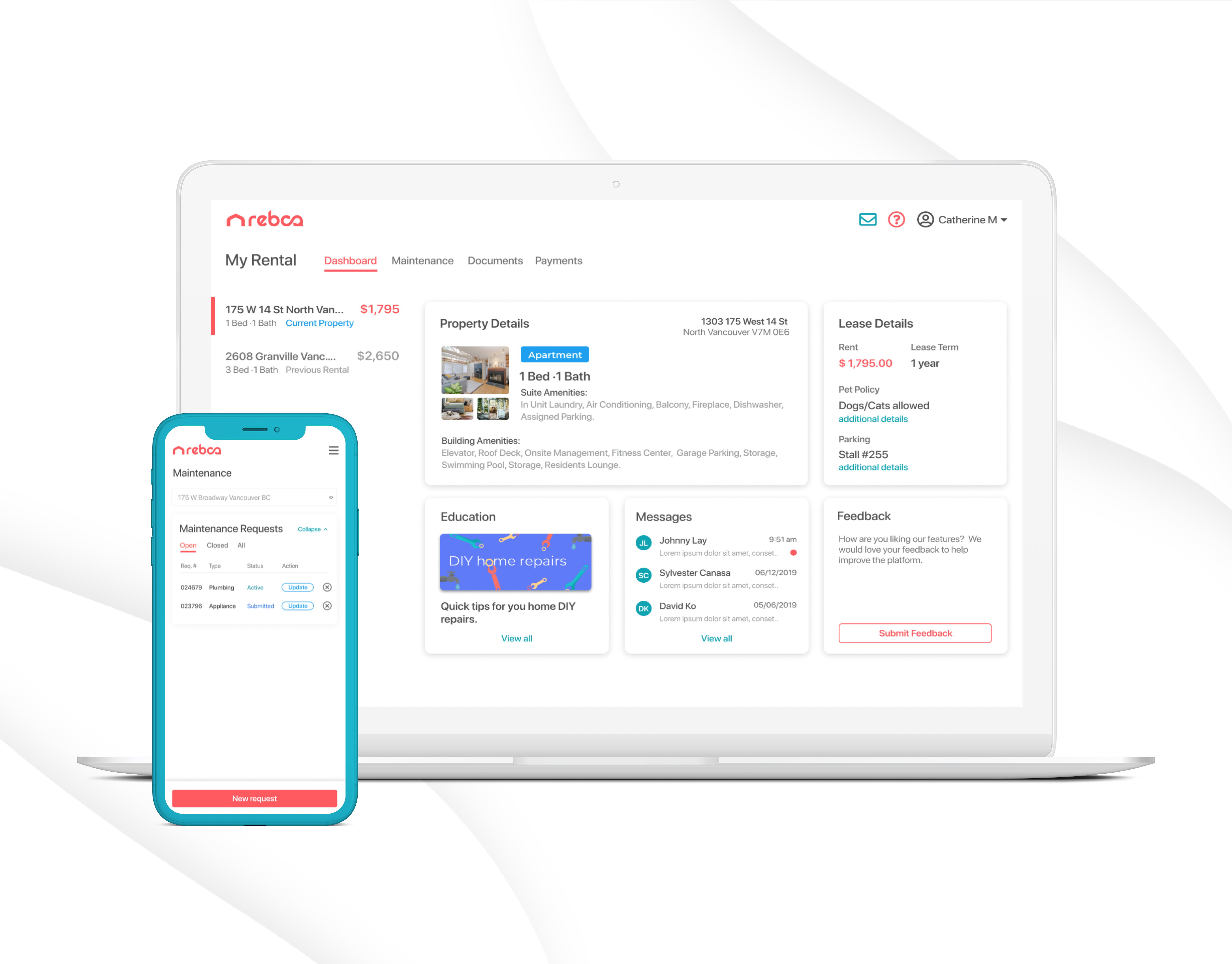
For the Beta release I focused on Maintenance Requests, Dashboard, Properties, and Messaging-as well as an onboarding flow. Below you will see a few screens going over the application's main navigational sections. For this case study I will go over my process for the Maintenance Request System in more detail. If you are interested in seeing a detailed breakdown of the other features and flows, please reach out via my contact form. Our research and timelines indicated that the best route was a responsive web app for our initial release, therefore I focused on making the solution mobile and tablet friendly as well.
Mapping the Journey
Before I began designing the flow, I first took a look at the way in which landlords are currently navigating the space. For the purposes of this interaction I examined the flow of a landlord receiving and completing a request for service from a tenant.
Sketching possible solutions
Before moving into low and hi fi protoyping in Figma, my first step was to get out my notebook and start iterating, trying to work our the hierarchy of the request as well as what information was needed.
Mockup Progression
You can see from the example below the progression of the service request. Initial iterations were more simple and I used a scroll approach. As we started to have more discussions and product meetings about everything the landlord wants to do with a service request, and features that were going to provide more value to the user, I had to go back to the drawing board. The challenge with this feature was the amount of data that is in a service request, and how to display this data in an easily digestible format.
Maintenance Requests: Desktop View
In order to make this feature provide the most value for the user, the "ticket" requires: description of the issue, a historical record of activity, communications, ability to add a vendor and request a quote/book service, tenant availability, and a section to add any private notes related to the issue. In addition to this, the ability to perform quick actions like update status and update priority of a ticket from the requests dashboard provides added value for a user who is managing several properties (a property manager), and needs to quickly scan and prioritize tickets. Taking this sector of our user base into consideration in the early stages will be helpful as we scale up.
The Flow: Adding a Vendor
One of the biggest value added features of the maintenance requests system is the ability to search and add a vendor, as well as send the entire request to the vendor. The current back and forth process of emails and phone calls between landlord and tenant and landlord and vendor was identified as a major pain-point in this process. With the vendor relationship added to the process, the landlord can simply send all relevant details to the vendor, including tenant availability, with one click. If you would like to take a look at the maintenance requests system in more detail, you can do so via this Invision link or via the Figma file and prototype.
Next Steps
These features are currently in development, due to be ready to test in a closed beta August 26. I have created a testing and research plan to evaluate the ticketing system and other features which I will be implementing with the use of Lookback. After I have finished gathering the testing data the next steps are to iterate and work on the next set of features for our open beta release in December.
