Project Overview
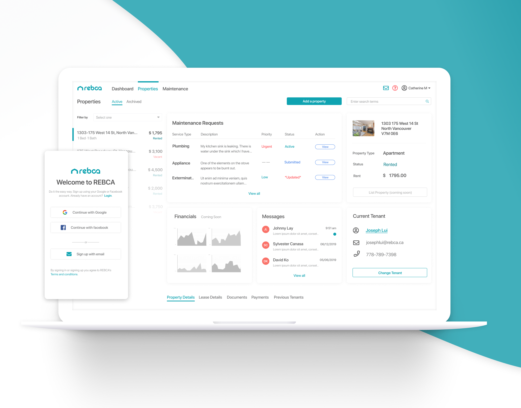
This project was created over a 6 month in period along side a property management solution that I was working on to address the needs of landlords and tenants using technology in the proptech space. You can also take a look at the landlord portal. This project is focusing on the tenant side of the relationship and what their needs and goals are handling their rental. The challenge with tenants is how do we provide value and keep them engaging with their landlords and property managers using our platform.
Tools Used
Figma, Sketch, Invision, Lookback.
Approach
Research
Project Vision
Our vision is to improve working relationships between landlord and tenants, ensuring a longer tenancy.
Goal
Double the average length of tenancy terms with good tenants by cultivating trusting and harmonious relationships between landlords and tenants.
Hypotheses
We believe that integrating education tools in our platform would empower users by informing them of their rights. We will know this is true when our research identifies a lack of education in the space.
We believe that in-app communication will improve the tenant/landlord relationship. We will know this is true when a theme around current communication is identified as a pain-point in our research.
We believe that the ability to make payments within the platform will help tenants manage their finances. We will know this is true when the our research identifies that current process of paying rent and associated bills inefficient
We believe that implementing a system of tiered data sharing would establish trust in the platform; allowing users to be comfortable with sharing sensitive data with the platform. We will know this is true when a direct relationship with trust and data sharing is validated via our research.
Findings
I used a mixture of surveys and interviews to gather data. I interviewed 5 tenants and had 50 survey respondents. If you are interested in seeing the full survey data you can view it here.
Quantitative Results:
-54% of respondents are living in an apartment/condo
-56% are either living with a roommate or significant other
-when asked what verification process they go through prior to signing the lease agreement 77% completed reference checks and 56.2% completed some form of income verification/credit check
-68% had their lease agreements delivered on paper
-when asked how they pay their rent 38.8% pay by E-transfer, 32.7% by post-dated check, and 18.4% by automatic withdrawal
-92% of respondents store documents related to their rental; 36% of those shove it in a drawer somewhere-having difficulty locating information when they need it.
-80% communicate with their landlord primarily by text or messaging services (whats app, fb messenger, etc)
-when asked how long it takes issues to be resolved with their rental 39.6% said within the week and 27.1% wait more than two weeks to have their issue resolved
-68% of respondents would prefer to use a mobile phone to access a solution to manage their rental, 30% on desktop/laptop, and 2% on tablet.
Major Pain-points Identified with current rental:
-Bill payments/Bill splitting among roommates
-Dealing with Maintenance issues
-Accessing information related to rental
-Communication issues with landlord
Major Pain-points Identified when looking for a new rental:
-Competition in the market
-Cost/Affordability
-Security
-Finding information about the neighbourhood
Target
I used the data gathered in my findings to determine our primary, secondary, and tertiary target audience as well as some of their pain-points, goals, and motivations.
Exploring a Solution
The MVP
I used the data gathered from my research to formulate 109 tenant user stories organized by epics. I then went in and prioritized each user story as we began to work on the feature. Given that our primary focus for our closed beta was to provide the most value to the Landlord (who will essentially be our paid user) with the tenant as our secondary consideration, we decided to focus on providing the support for handling Maintenance Requests, My Rental Dashboard, , and Messaging. Payments and financial tracking was identified as a major issue to both parties, however due to time constraints and feature prioritization, combined with the complexity that comes along with handling payments, this feature was slated for version 2. Other features that will be included in the next phase of the release will include the ability to search listings, tenant verification profiles, document storage and lease agreement signing, and a booking system for viewing new rentals.
Some of the major stories that helped to formulate our MVP were:
Maintenance Requests:
1. As a Tenant I want to be able to see the status of a request so that I know what point of the process it is in.
2. As a Tenant I want to be able to submit a request online so that I can speed up the process and have a record
3. As a Tenant I want to be able to set urgency so that urgent issues get dealt with immediately.
4. As a Tenant I want to be able to set my availability so that I can control when someone is coming to my suite.
My Rental Dashboard:
1. As a Tenant I want to see the information about what my property includes so that I can access this information easily.
2. As a Tenant I want access to my lease terms so that I know when it is up and what the specifics are.
3. As a Tenant I want to submit a service request so I can request an issue to be resolved.
Education:
1. As a Tenant I want to know my rights so that I can make informed decisions.
2. As a Tenant I want to be able to ask questions I don't know the answers to so that I can make informed decisions.
3. As a Tenant I want to receive the information in a digestable format so that I understand the information.
Messaging:
1. Tenant I want a more formal way to communicate with co-tenants and landlords so that I can keep a record.
2. As a Tenant I want to receive notifications when a message is received so that I don't miss it.
3. As a Tenant I want to know when my message has been read so that I know that it has been seen.
Mapping the Information Architecture.
Before beginning the UX work on the features I first took a look at the Navigational Structure in order to determine how our application was going to function and where each of our MVP features would be accessed within the app. This navigational structure will continue to grow as we add more features but will continue to use a typical hierarchal structure.
Impact
Solution
For the Beta release I focused on Maintenance Requests, My Rental Dashboard, Education, and Messaging-as well as an onboarding flow. Below you will see a few screens going over the application's main navigational sections in both mobile and desktop view. For this case study I will go over my process for the Maintenance Request System in more detail. If you are interested in seeing a detailed breakdown of the other features and flows, please reach out via my contact form. Our research and timelines indicated that the best route was a responsive mobile friendly web app for our initial release, as users indicated that they would mostly use mobile to access the app; with a large percentage still stating they would prefer to use a laptop.
Desktop view
Mobile view
Mapping the Journey
Before I began designing the flow, I first took a look at the way in which a tenant currently navigates the space. For the purposes of this interaction I examined the process a tenant currently goes through when they discover an issue. I used this process to identify major pain-points they encounter through this process and opportunities for features which can help address them.
Sketching possible solutions
Before moving into low and hi fi protoyping in Figma, my first step was to get out my notebook and start iterating, trying to work our the hierarchy of the request as well as what information was needed.
Wireframing
The next step was to get the flows into low fidelity wireframes to begin testing the flows and working out any UX issues with the process early on. You can take a look at my Figma board of the wireframing process below.
Maintenance Request System: Desktop View
In order to make this feature provide the most value for the landlord and the tenant, the "ticket" requires: description of the issue, ability to set urgency, select a service type, attach issues, set availability, and let the end recipient know about any pets in the home. This cuts down on the back and forth and prepares the maintenance person for entry.
To provide value for the tenant once the ticket has been generated they need to be able to continue to communicate on the ticket, see the activity, update availability, and add any private notes for themselves.
You can view the entire flow via the Figma prototype.
Creating and viewing a request: Mobile view
The challenge faced with the timelines and the structure of a mobile friendly app vs a native app meant that we had to make some decisions regarding ticket structure that were not the ideal solution for a user friendly experience. An example of this is the card system and the current navigation structure. I am working with our front end developer currently to implement a more tailored user friendly mobile solution for the open beta version. If you want to see the full flow check out the Figma prototype below.
Next Steps
These features are currently in development, due to be ready to test in a closed beta August 26. I have created a testing and research plan to evaluate the ticketing system and other features which I will be implementing with the use of Lookback. After I have finished gathering the testing data the next steps are to iterate and work on the next set of features for our open beta release in December.
