Background
Shapr is an app for meeting business professionals for purposes of finding employment, seeking/looking for mentorship, and establishing other business connections. Myself and Pilar chose to evaluate this app through a Heuristics Evaluation to determine where the app was failing and what recommendations we could offer as a possible solution. For this evaluation we chose to focus on on-boarding. My roles in this project were UX/UI Design, building out the UI Library and conducting a heuristic evaluation.
The Task
Onboarding
For the purposes of this evaluation we decided to focus on on-boarding as this is the first interaction a user comes in contact with. We focused on 5 heuristics: User Control and Freedom, Consistency and Standards, Error Prevention, Match Between System and Real World, and Aesthetic and Minimalist Design.
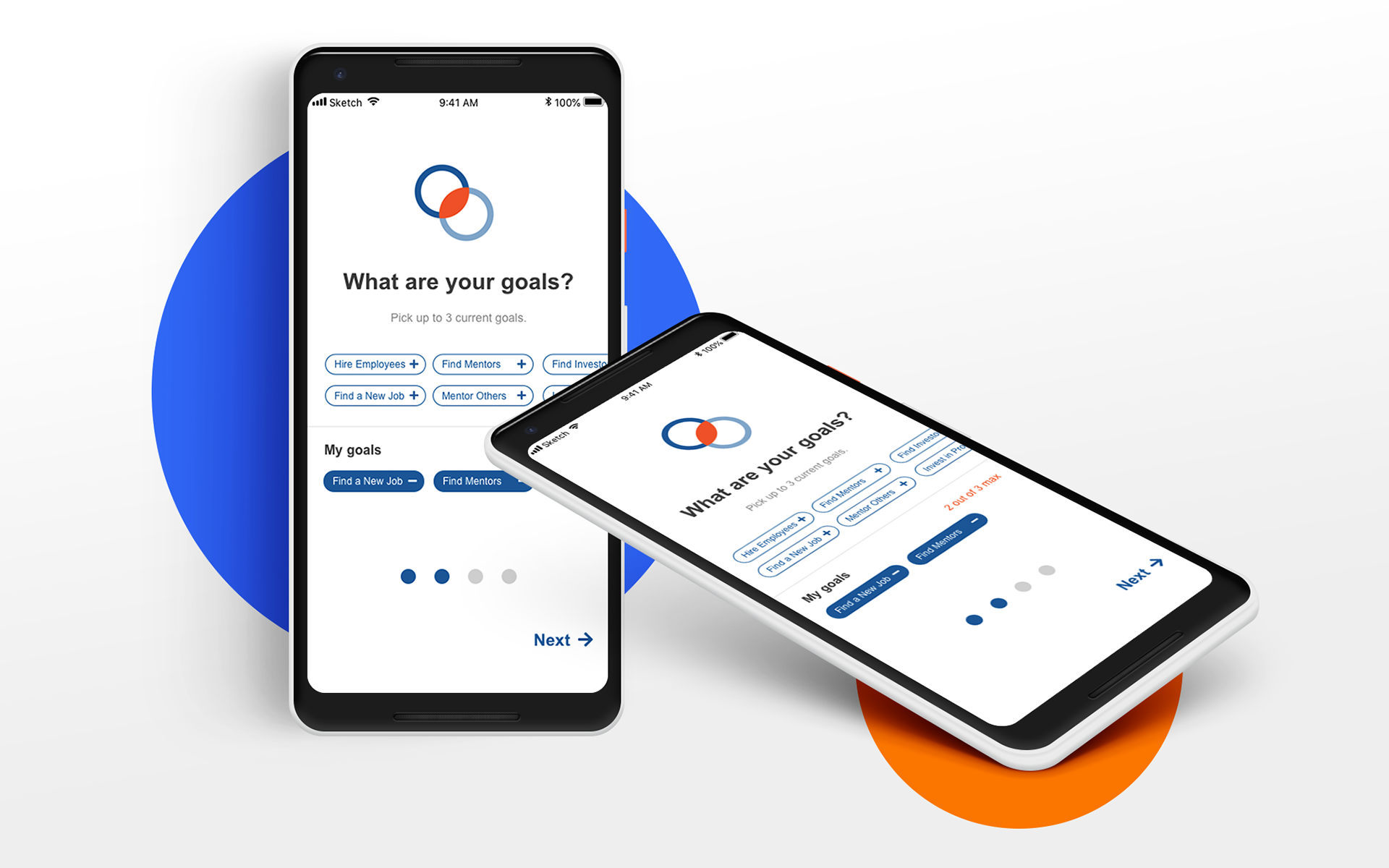
Current Flow
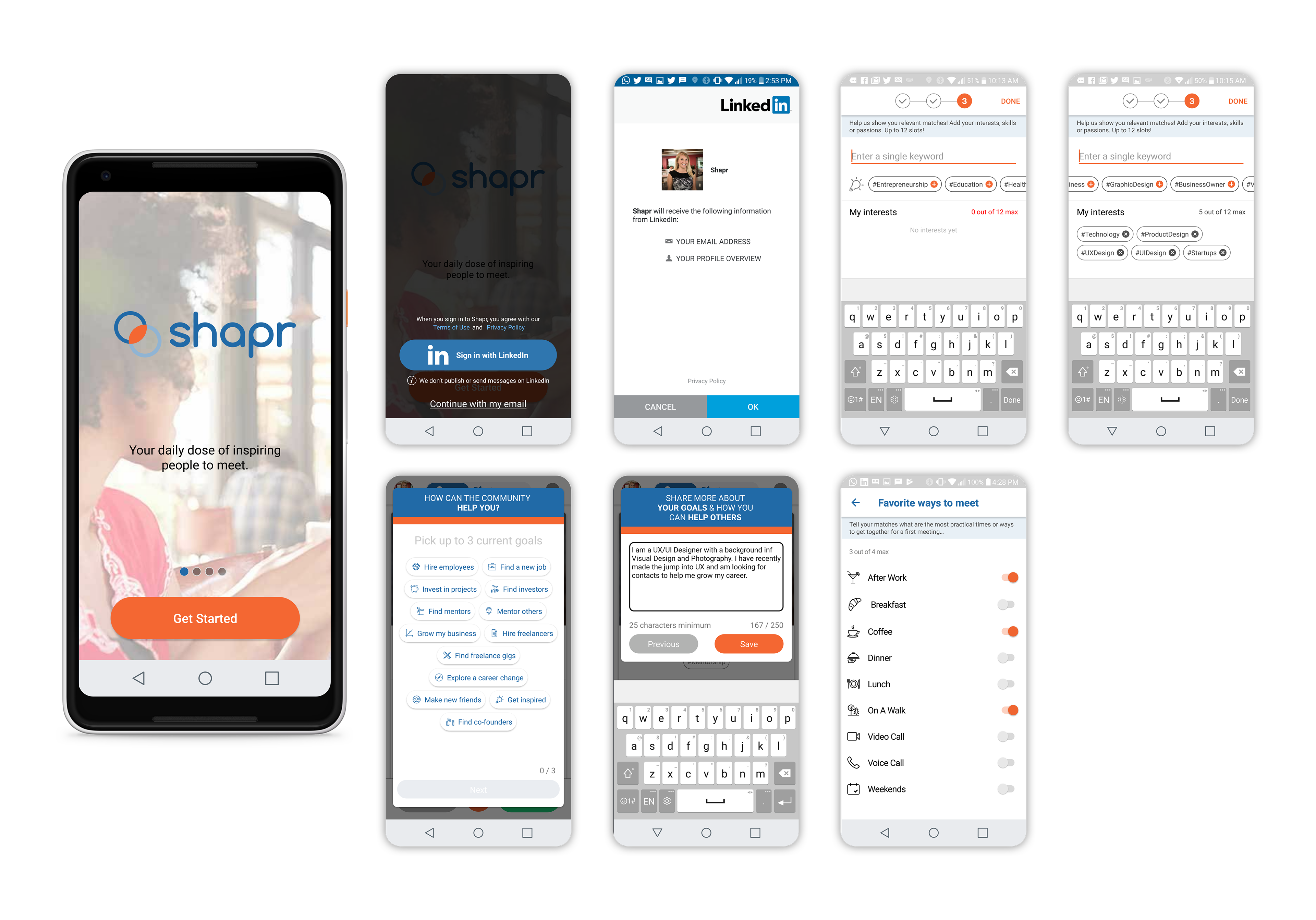
Below is an overview of the current Shapr on-boarding flow which we evaluated and offered recommendations for.
Evaluation
User Control and Freedom
With Shapr, when you sign up with Linkedin you are unable to control which information is brought over. When the profile is created for Shapr, your photo, email, name, and title are brought over to Shapr. You then need to enter your Work History and Education manually. There are additional violations of this heuristic throughout the app, but for the purposes of this evaluation we are focusing on the task of on-boarding.
Score: 3/5
Recommendation: Add options for the user to bring over all information from Linkedin when creating a profile.
Consistency and Standards
When walking through the on-boarding process, every step of the process has different methods for selecting information. The indicators of where you are in the process also change based on the screen, and, in some cases, are not true to what step you are actually on. Language was inconsistent and unclear throughout the process and in some cases it was unclear the purpose of asking information or what they were asking for.
Score: 2/5
Recommendation: Create an on-boarding process that is visually consistent from screen to screen. Add consistent interactions to create expected behaviours. Add indicators of where you are in the process and language which is easy to understand.
Error Prevention
Shapr does not auto correct spelling nor does it indicate when an error has been made. We found this to be very detrimental to the usability of the app being that this app is intended for career advancement. For example, I made an error in my Bio and did not notice till reviewing my profile. Additionally, when I went in to try and correct the error, I was unable to without having to go back through on-boarding.
Score: 2/5
Recommendation: Create a system which diagnosis errors and offers options to quickly and easily correct them.
Match Between System and the Real World
Shapr scored low on this heuristic due mostly to inconsistency of language and process throughout the on-boarding process. For example the word teleporting was used in the app to set your home location, however teleporting implies that you would be going somewhere else. Also, the selection of items being inconsistent creates the feeling that you are no longer completing the process. In the real world this process in linear.
Score: 2/5
Recommendation: Use consistent language which is easy to understand. Create a consistent linear flow to guide the user through every step of the process.
Aesthetic & Minimalist Design
Shapr did not score well on this heuristic. Some of the design choices which violated this included the use of orange. They use orange throughout the app; we found that this choice, particularly when used on buttons indicated that the user might be doing something wrong, when in-fact that was not the case. Issues were also evident in terms of text hierarchy and their use of the grid system (which was not followed in most cases).
Score: 1/5
Recommendation: Make use of negative space. Limit text styles and use of orange to create an overall more positive experience.
The Redesign
On-boarding Flow
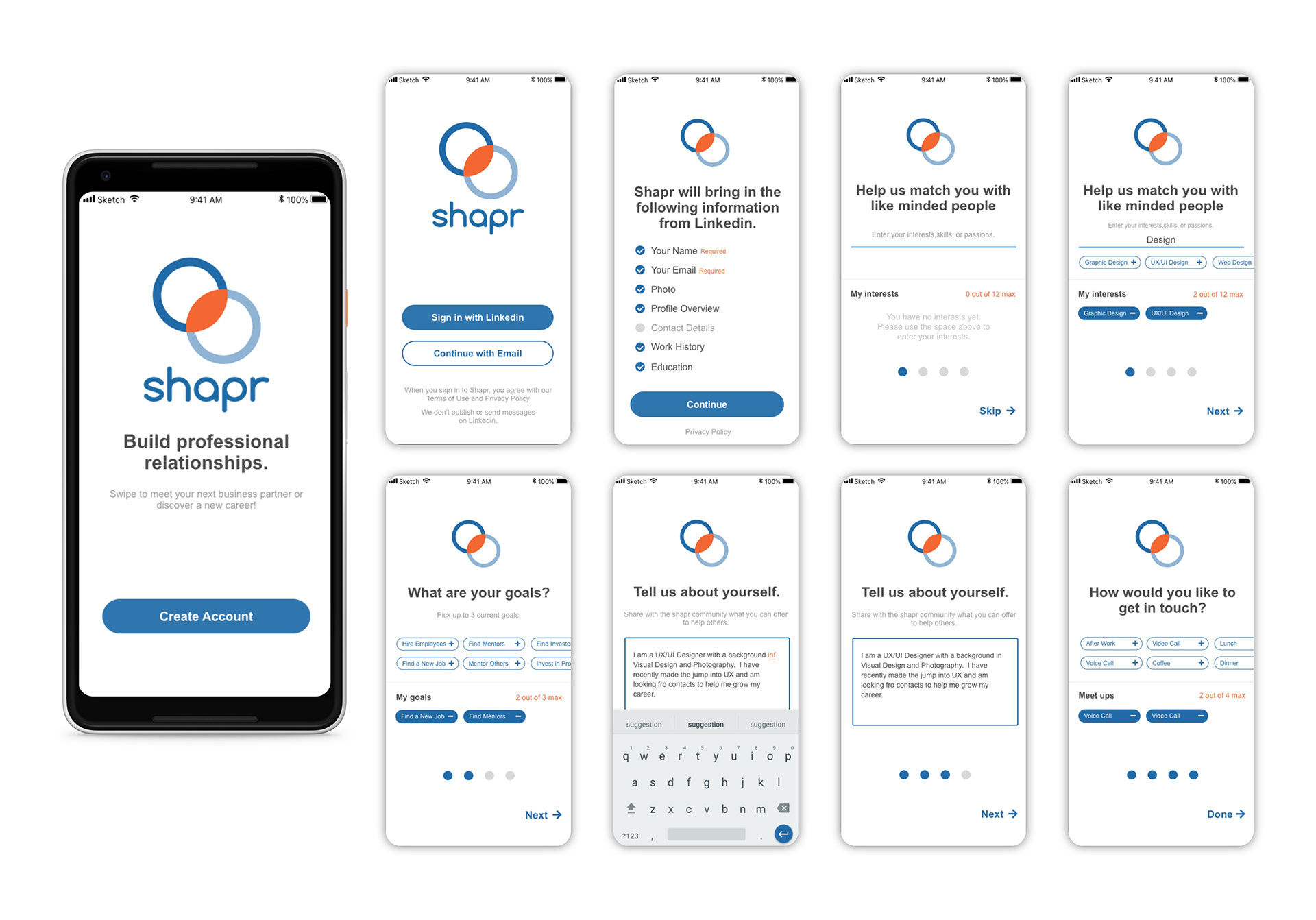
The app scored really low overall (40%) on the usability of on-boarding. Taking the recommendations from the evaluation we redesigned this entire process, while staying true to brand colors and typography choices.
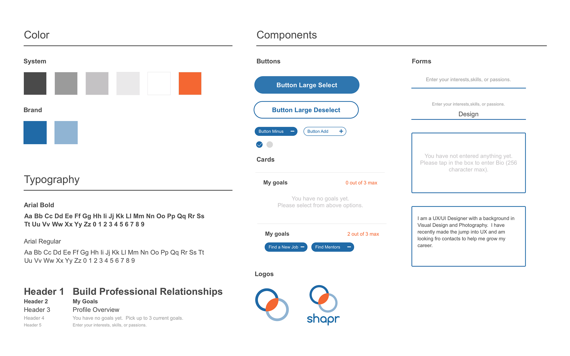
UI Library
In order to maintain consistency when continuing on with the redesign we created a UI library which included typography, colors, and components. This library was also helpful as we both continued to make updates to the app.